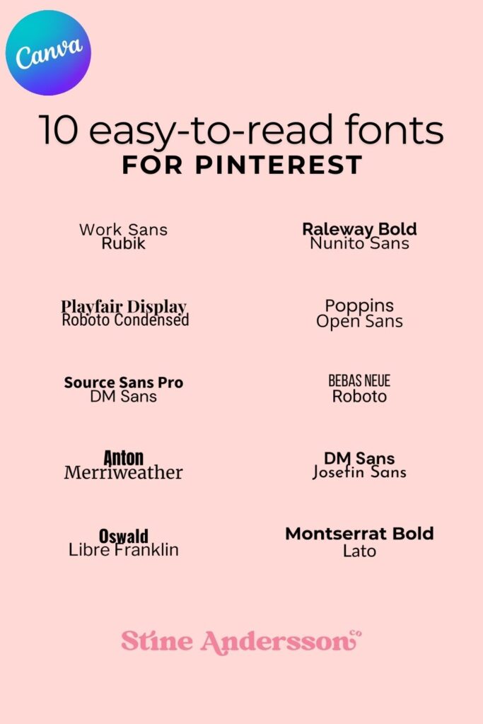
In the world of design, choosing the right font combination can make or break your project. Whether you’re creating eye-catching Pinterest graphics, professional presentations, or social media posts, picking modern and easy-to-read fonts is essential. Canva, the popular design platform, offers a plethora of font options, but narrowing them down to the perfect pair can feel overwhelming. That’s why we’ve curated 10 versatile and stylish Canva font combinations that balance aesthetics and readability.
Save them for later

Why Font Pairings Matter
Fonts do more than display text—they set the tone for your design. A carefully chosen font combination can evoke emotions, highlight important messages, and ensure your content is engaging. Poorly paired fonts, on the other hand, may make your design look unprofessional or difficult to read. With so much competition on platforms like Pinterest, where visuals reign supreme, your choice of easy-to-read font pairings can directly impact your success.
10 Canva Font Combinations for Modern and Readable Designs
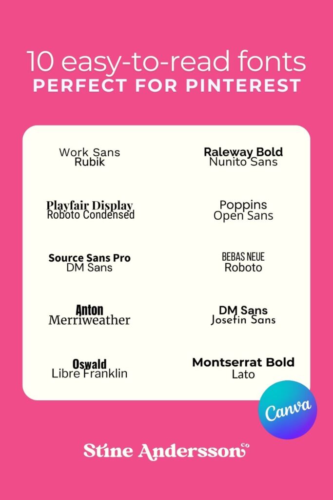
Here’s a curated list of Pinterest-worthy font pairings that are both stylish and legible. These combinations are perfect for headings, subheadings, and body text across a variety of design projects:
- Montserrat (Bold) + Lato (Regular)
- A sleek and versatile pairing. Montserrat’s boldness is ideal for headlines, while Lato adds a clean and contemporary touch for body text.
- Poppins (SemiBold) + Open Sans (Regular)
- With a modern and geometric aesthetic, this duo is great for infographics, presentations, and social media graphics.
- Bebas Neue + Roboto (Regular)
- Bebas Neue’s all-caps format creates a bold, impactful headline, while Roboto keeps the supporting text legible and professional.
- Raleway (Bold) + Nunito Sans (Regular)
- Raleway brings an elegant edge to titles, while Nunito Sans ensures a warm, approachable feel for your body text.
- Oswald (Bold) + Libre Franklin (Regular)
- Oswald’s condensed structure pairs beautifully with Libre Franklin’s simple readability. A perfect match for minimalist designs.
- Anton + Merriweather (Regular)
- Anton grabs attention with its bold and compact style, while Merriweather adds a classic serif look, balancing modernity with tradition.
- Playfair Display (Bold) + Roboto Condensed (Regular)
- This pairing merges the sophistication of a serif font with the clean practicality of a sans-serif font, ideal for blogs and editorial-style designs.
- Work Sans (SemiBold) + Rubik (Regular)
- Both modern and playful, these fonts are excellent for upbeat Pinterest graphics and creative branding.
- Source Sans Pro (Bold) + DM Sans (Regular)
- A reliable and versatile pairing, offering crisp clarity for any design.
- DM Sans (Bold) + Josefin Sans (Regular)
- This combination is lightweight and stylish, perfect for minimalist Pinterest pins and Instagram carousels.
Save them for later

How to Use These Canva Font Pairings Effectively
Define Your Purpose: Each pairing serves a unique function. Bold fonts like Bebas Neue and Anton are best for headlines, while fonts like Lato and Open Sans work well for body text.
- Create Visual Hierarchy: Use bold fonts for attention-grabbing titles and lighter, regular fonts for easy-to-read paragraphs.
- Stick to a Color Palette: The right colors can enhance the impact of your font combination. Opt for high-contrast text and background colors for better readability.
- Test for Mobile: Pinterest and other platforms are often viewed on mobile devices. Ensure your fonts remain legible on smaller screens.
Why These Font Pairings Work for Pinterest
Pinterest thrives on visuals, and easy-to-read fonts are essential for capturing attention amidst the scrolling frenzy. With bold headings and complementary body text, the 10 font combinations listed here help you stand out. They also align with Canva’s wide range of templates, making it easy to create visually stunning designs in minutes.
Choosing the right fonts for your designs doesn’t have to be a guessing game. With these 10 carefully selected Canva font combinations, you can achieve modern, bold, and professional designs that captivate your audience. From Pinterest pins to Instagram posts, these easy-to-read font pairings ensure your message is both visually appealing and accessible.
Explore these fonts in Canva, and watch your designs come to life with a perfect blend of style and functionality.
